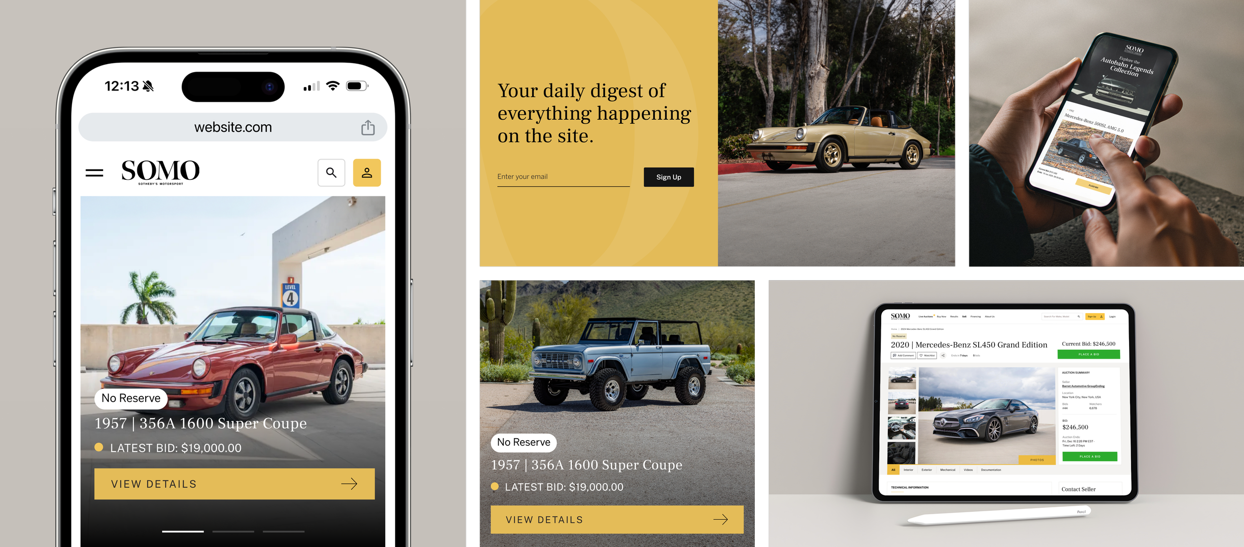
Designing a premium digital auction platform for modern collector vehicles
Evolving the platform across web, mobile, and seller tools created a more seamless luxury auction experience for modern collectors.
Overview
As part of the Paktolus design team, I contributed to the evolution of Sotheby’s Motorsport’s digital auction platform across multiple phases of growth. What began as a redesign of the website and mobile experience expanded into seller-facing tools, platform-wide UX improvements, and a complete visual refresh aligned with a new luxury brand direction. The project focused on creating a more seamless experience across vehicle discovery, bidding, and seller workflows while elevating the platform through a more refined and scalable UI system.
Project Evolution
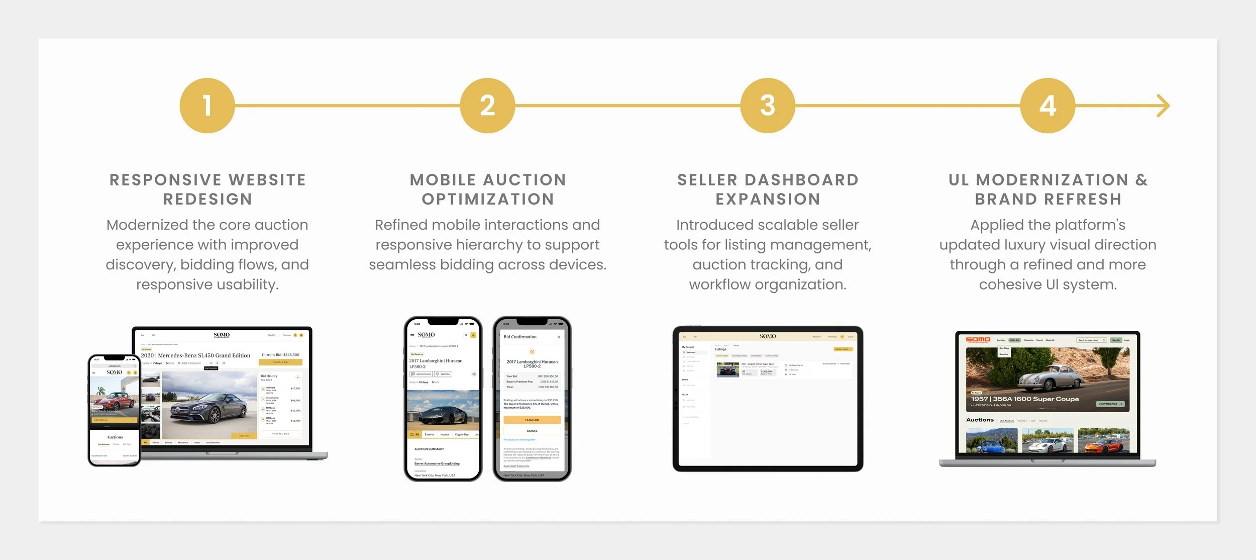
As the platform evolved, the scope expanded beyond a traditional responsive redesign into a broader product ecosystem that included seller tools, mobile optimization, and a complete UI modernization aligned with a new luxury brand direction.
My Role
Product Designer
Visual Direction
Art Direction
Team
Valeria Diaz (PM)
Sebastian Roach (VD)
Aldo Mora (PD)
Victor Hugo (3DM)
Client
Sotheby’s Motorsport
Website
sothebysmotorsport.com

PROJECT IMPACT
Building a scalable auction platform for the future of luxury automotive
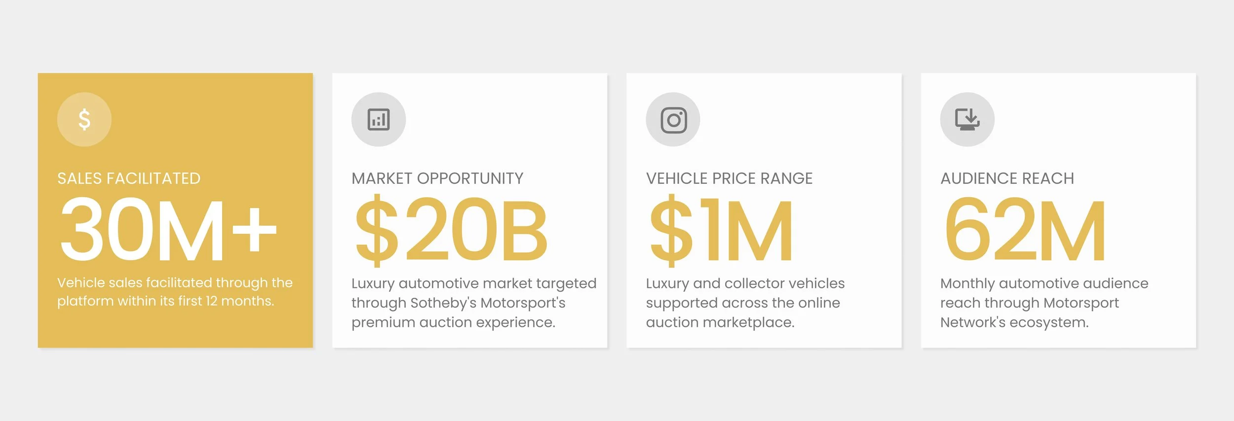
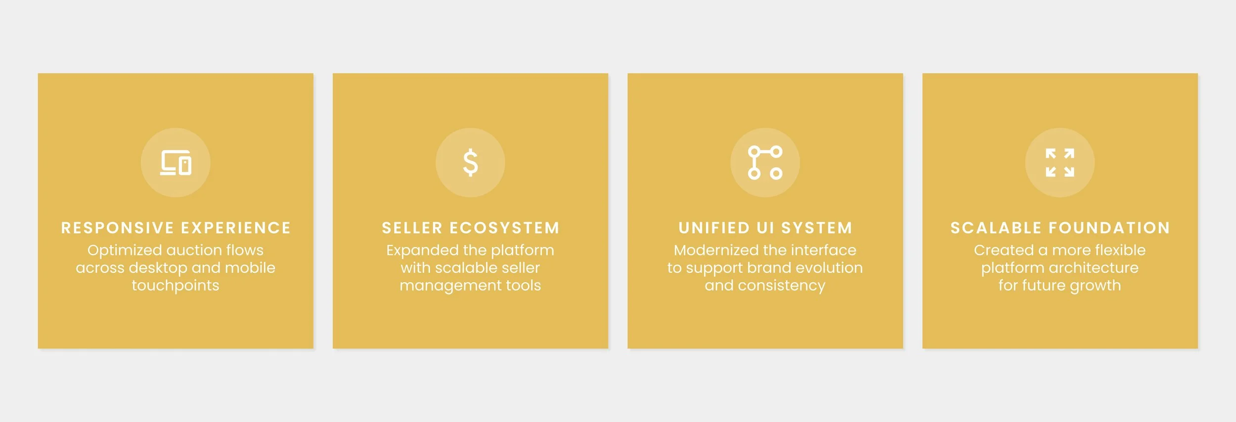
The redesign established a more scalable foundation for Sotheby’s Motorsport’s evolving auction ecosystem, creating greater consistency across vehicle discovery, bidding, seller management, and responsive experiences. By streamlining workflows and modernizing the platform’s UI system, the experience became more cohesive across both customer-facing and seller-facing touchpoints while supporting the brand’s continued digital growth and evolving luxury direction.
PLATFORM EVOLUTION
Balancing premium storytelling with high-performance auction worktlows
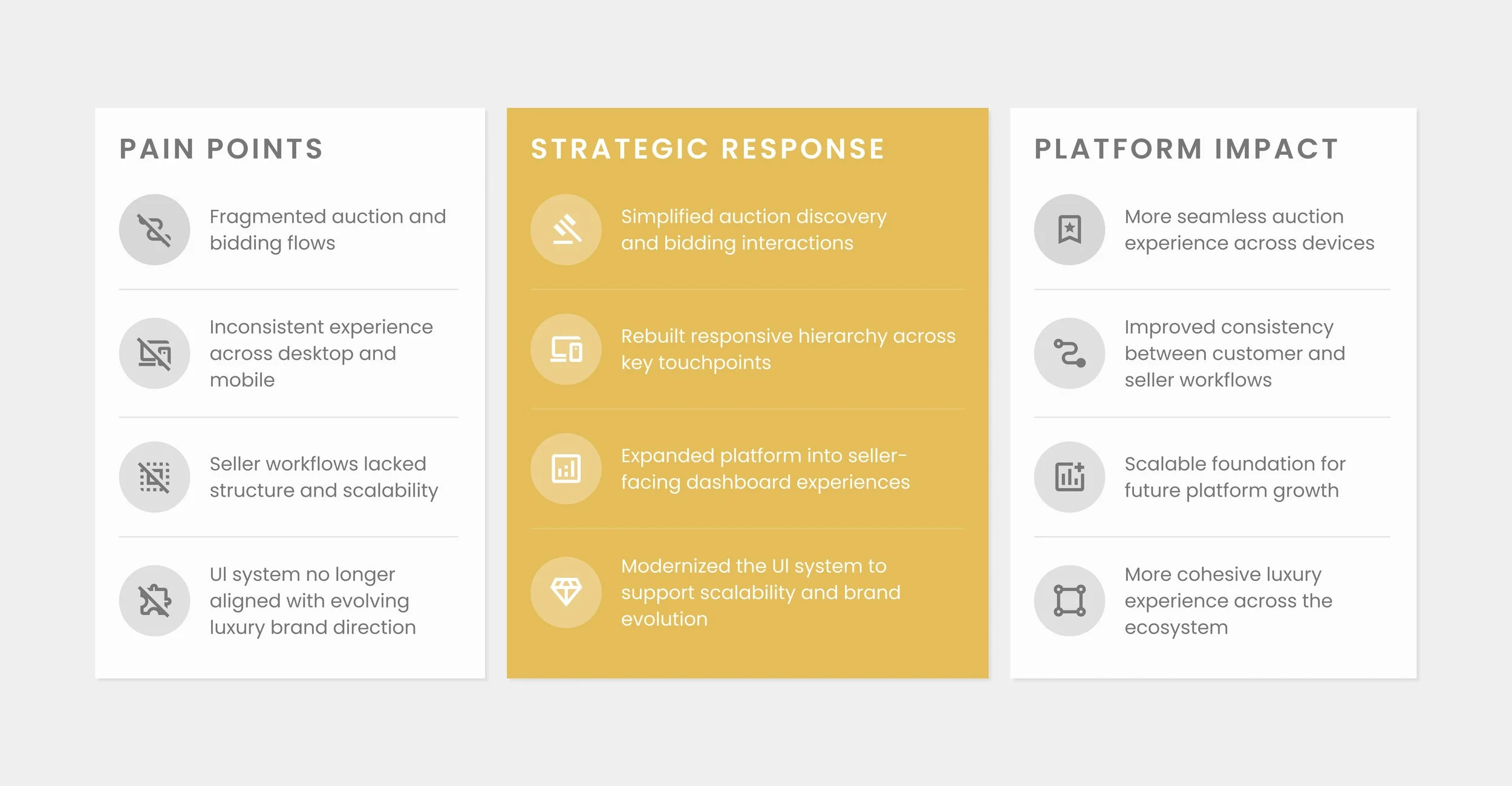
The discovery phase focused on understanding how users navigated vehicle discovery, bidding, and seller workflows across the evolving auction platform. Through UX evaluation, responsive analysis, and structural review, we identified opportunities to improve discoverability, simplify auction interactions, and create greater consistency between customer-facing and seller-facing experiences. These insights informed a more scalable product strategy centered around responsive usability, streamlined workflows, and a refined luxury Ul system aligned with the platform's evolving brand direction.
PLATFORM EVOLUTION
Building a connected auction experience across web, mobile, and seller tools
The redesign focused on improving how users explored vehicles, participated in auctions, and managed listings across the platform. As Sotheby’s Motorsport continued to expand, the experience evolved beyond a traditional auction website into a more connected ecosystem spanning responsive bidding flows, seller management tools, and modernized interface systems. The work centered on simplifying interactions, creating greater consistency between buyer and seller experiences, and supporting the platform’s updated luxury visual direction across web and mobile touchpoints.
DESIGN EVOLUTION
Expanding the experience across multiple redesign phases
The platform evolved through multiple redesign phases focused on improving auction usability, expanding seller workflows, and adapting the experience to an updated luxury visual direction. As the ecosystem grew, each phase introduced new functionality, responsive refinements, and interface improvements that helped create a more connected experience across buyer and seller touchpoints.
EXPERIENCE CHALLENGES
Balancing premium automotive storytelling with auction usability
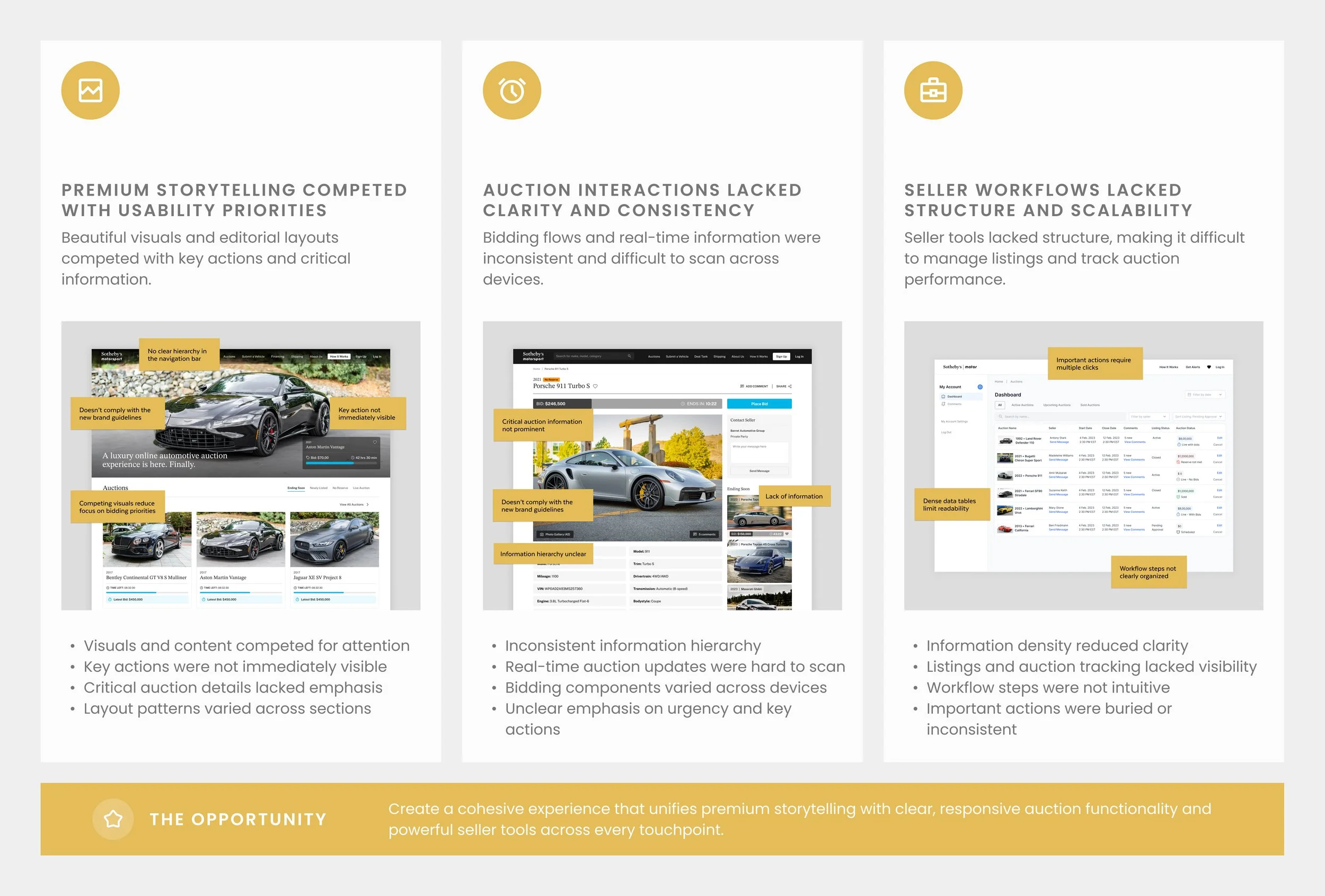
The existing experience prioritized visual presentation but created friction across browsing, bidding, and seller interactions. Auction information often competed for attention, responsive experiences lacked consistency across devices, and key workflows introduced unnecessary complexity throughout the customer journey. As the platform expanded, the experience required a more structured approach that could support both premium storytelling and high-performance usability across multiple touchpoints
EXPERIENCE FRAMEWORK
Designing the Platform Framework
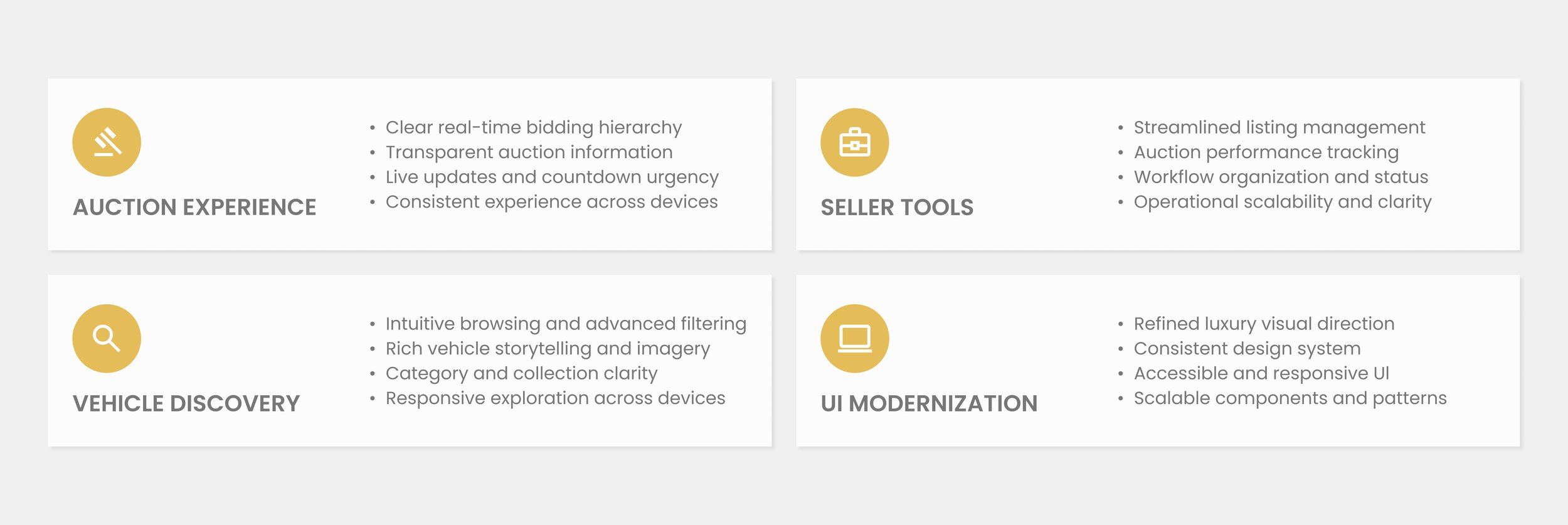
As the platform expanded, the experience needed to support a growing ecosystem of buyers, sellers, and auction interactions without sacrificing usability or brand quality. The redesign focused on creating a unified framework that connected vehicle discovery, auction participation, seller operations, and visual systems into a cohesive experience. By defining clear relationships between these core areas, the platform became easier to navigate, more scalable to manage, and better equipped to support future product enhancements.
PROBLEM STATEMENT
How can Sotheby’s Motorsport create a seamless auction experience that balances premium automotive storytelling, real-time bidding, and scalable seller workflows across every touchpoint?
VEHICLE DISCOVERY
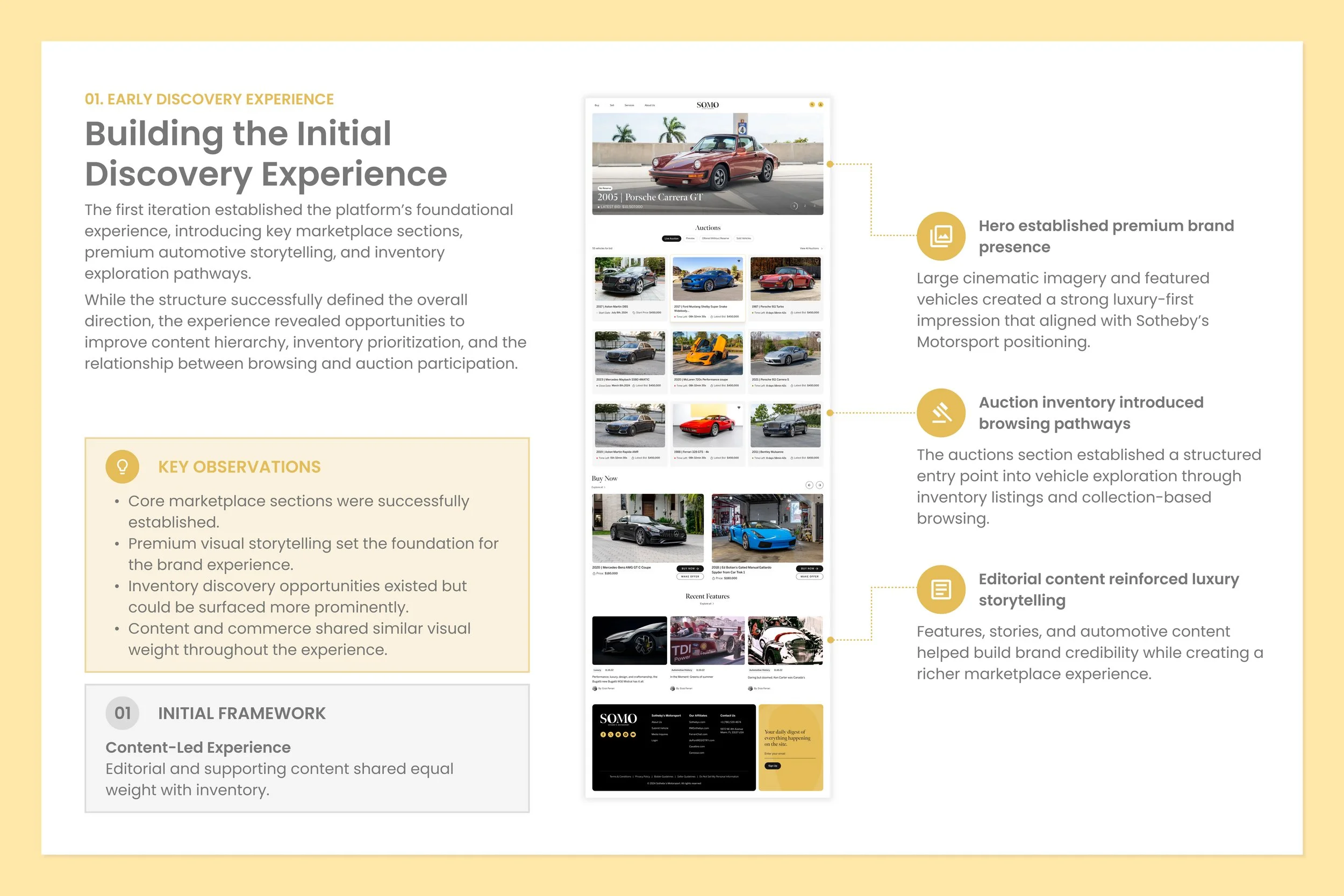
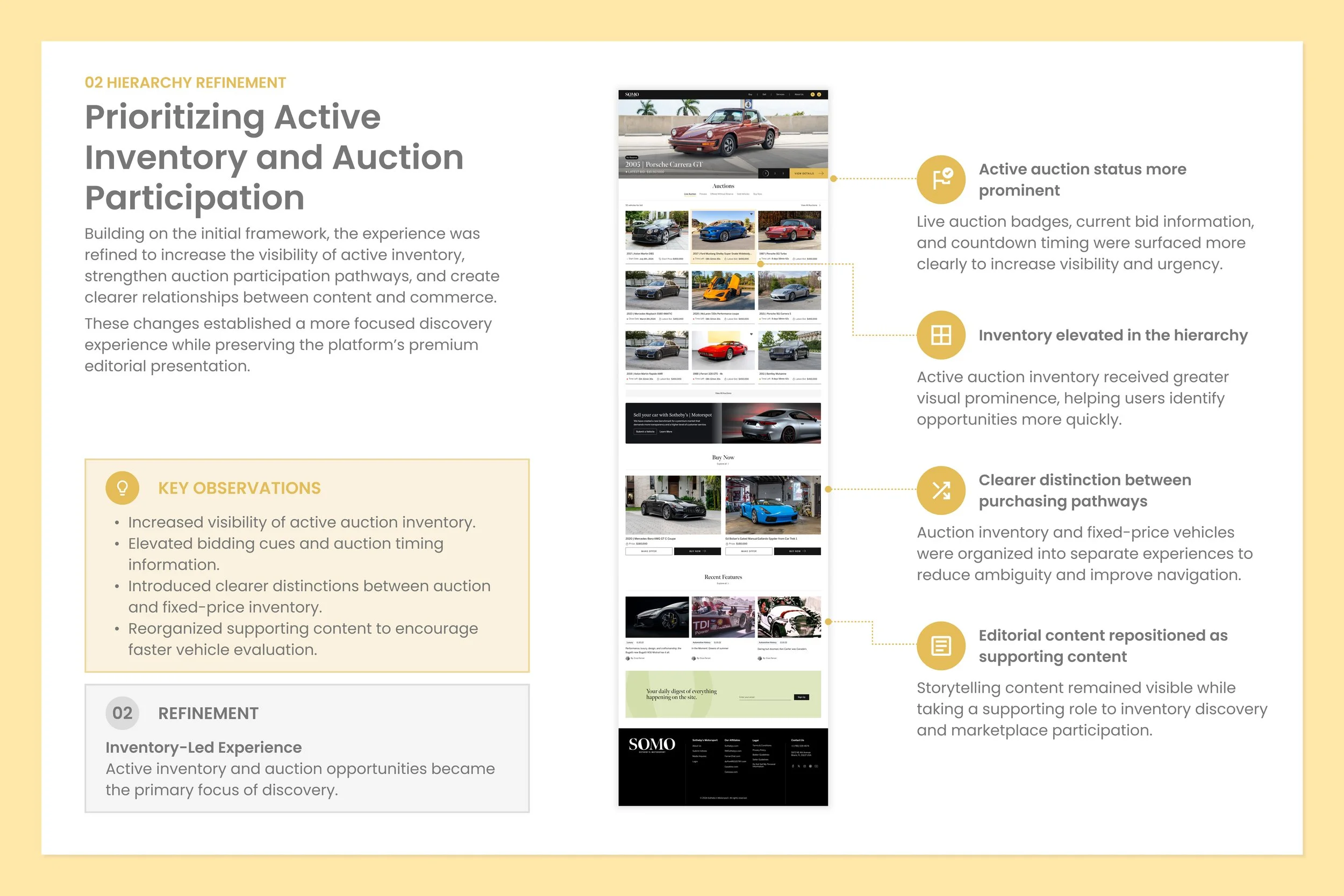
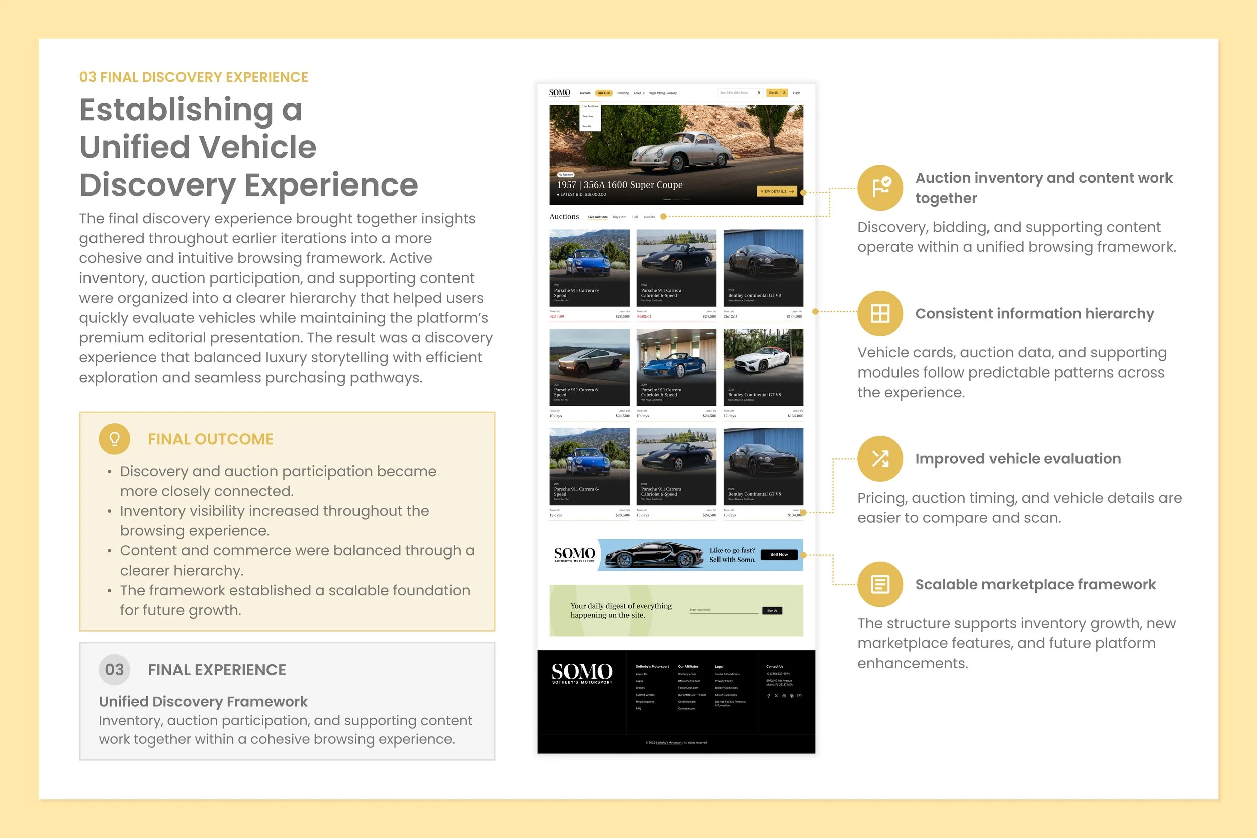
Connecting Discovery, Content, and Commerce
The discovery experience serves as the primary entry point into the auction platform, making it critical for both engagement and conversion. The redesign focused on creating a clearer pathway between browsing and bidding by improving inventory organization, search visibility, filtering systems, and content hierarchy. The goal was to help users quickly evaluate vehicles while preserving the premium storytelling expected from a luxury automotive marketplace.
AUCTION EXPERIENCE
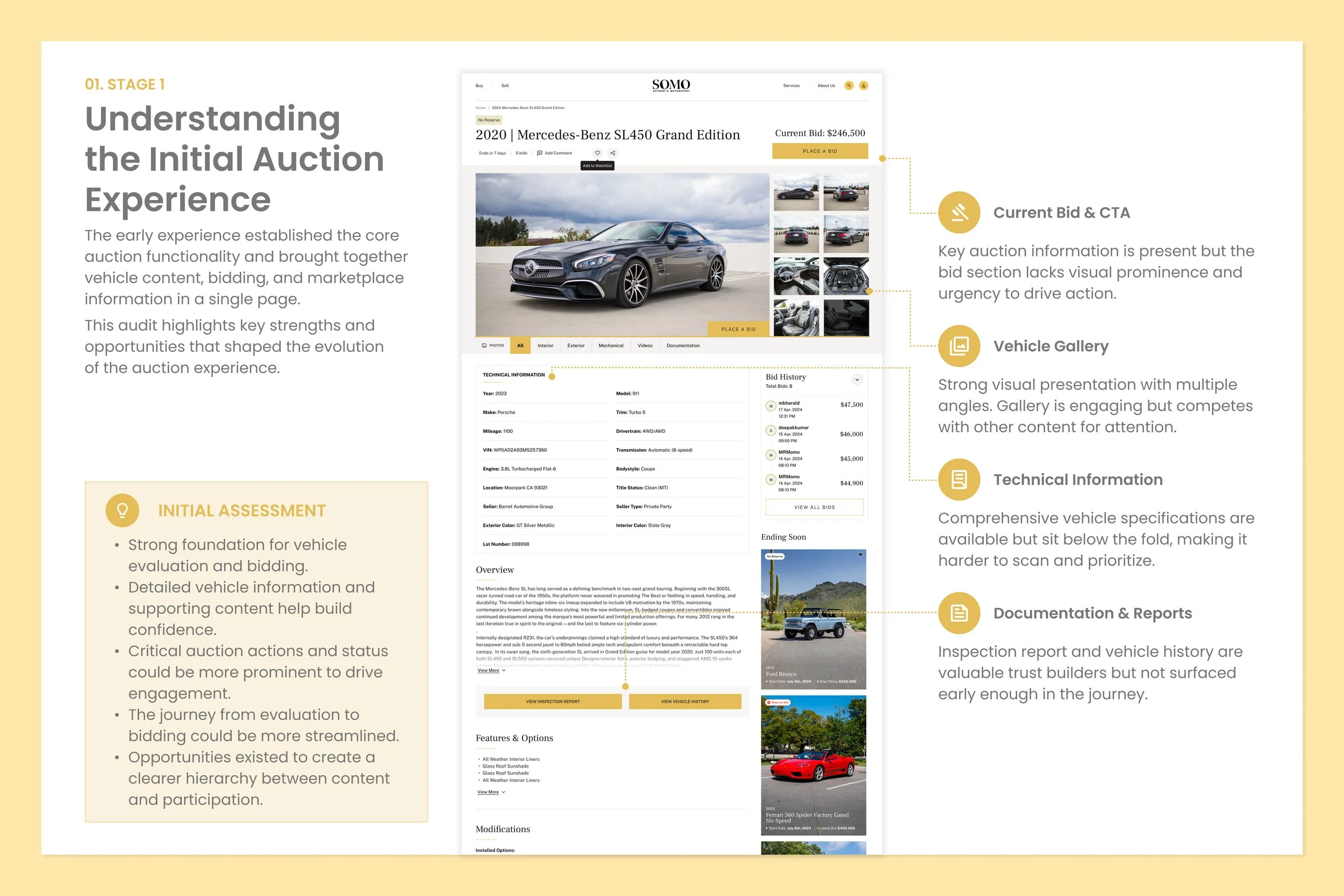
Creating clarity and urgency throughout the bidding journey
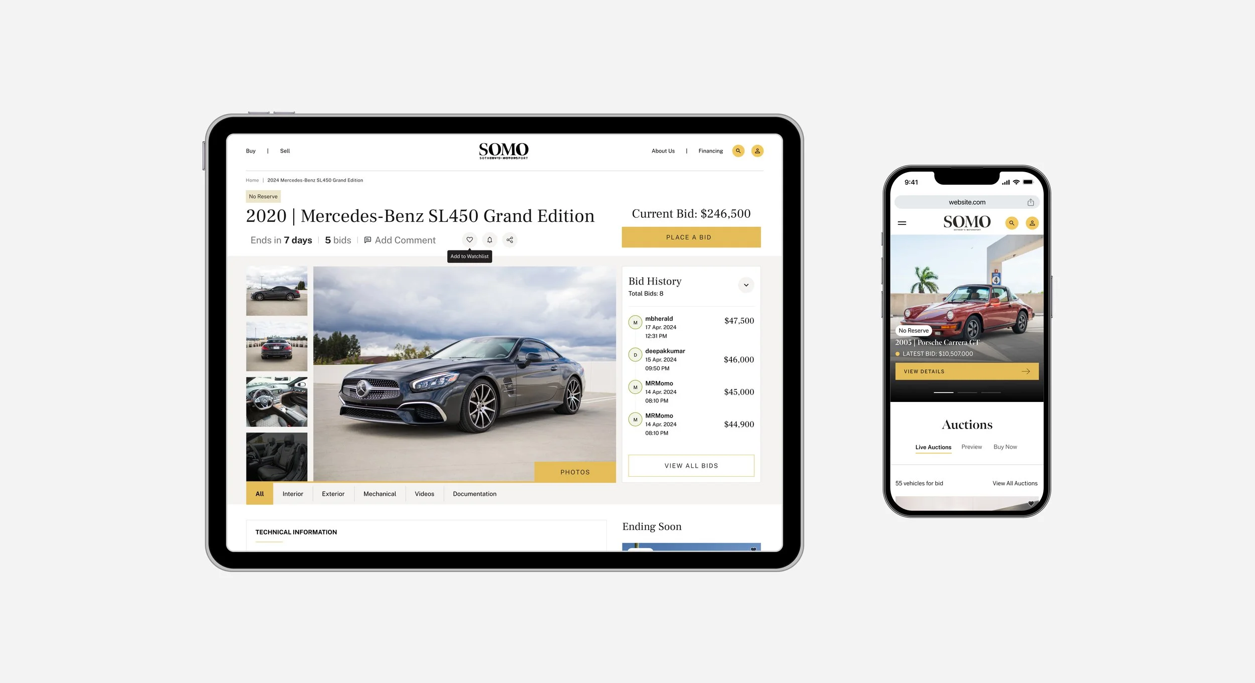
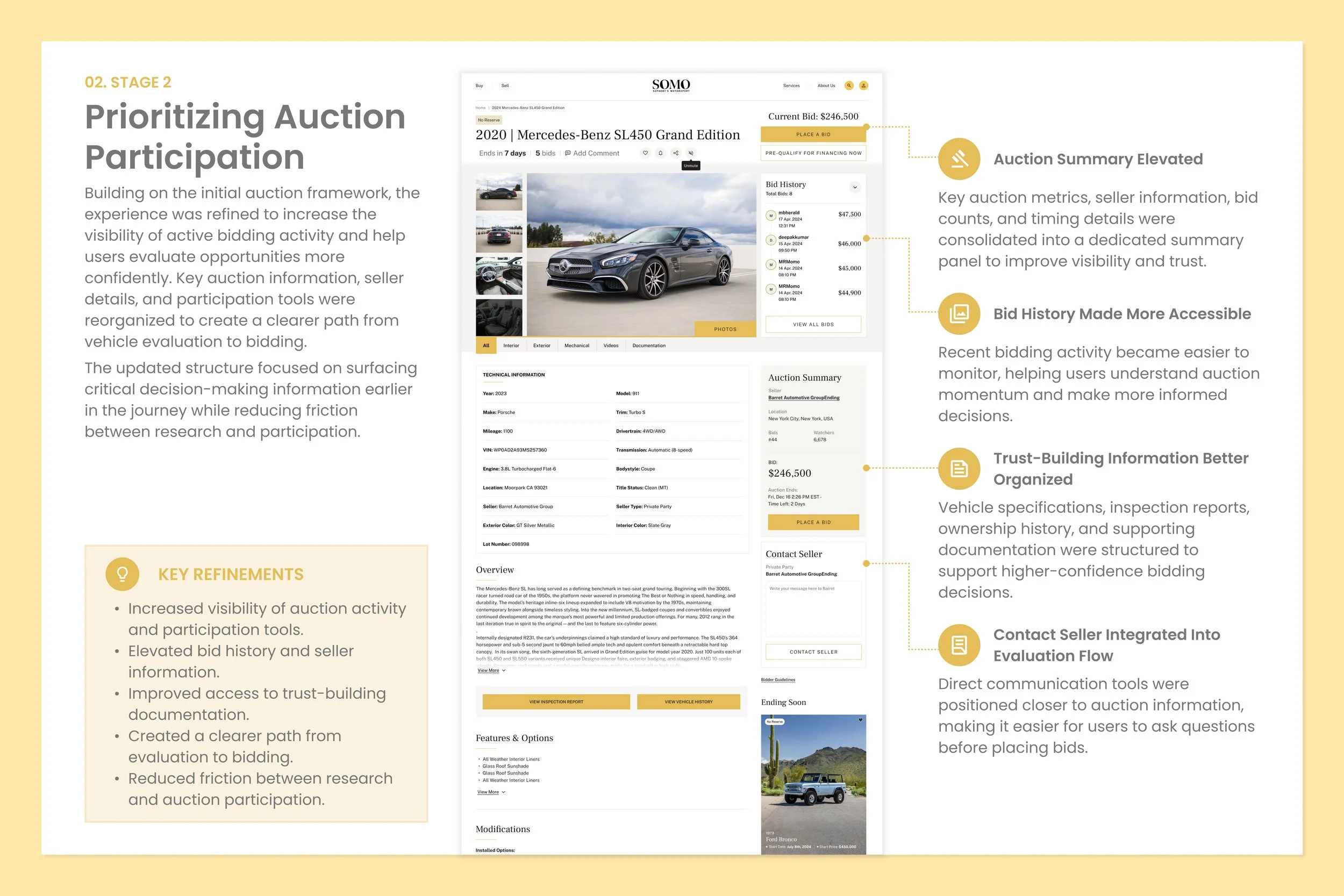
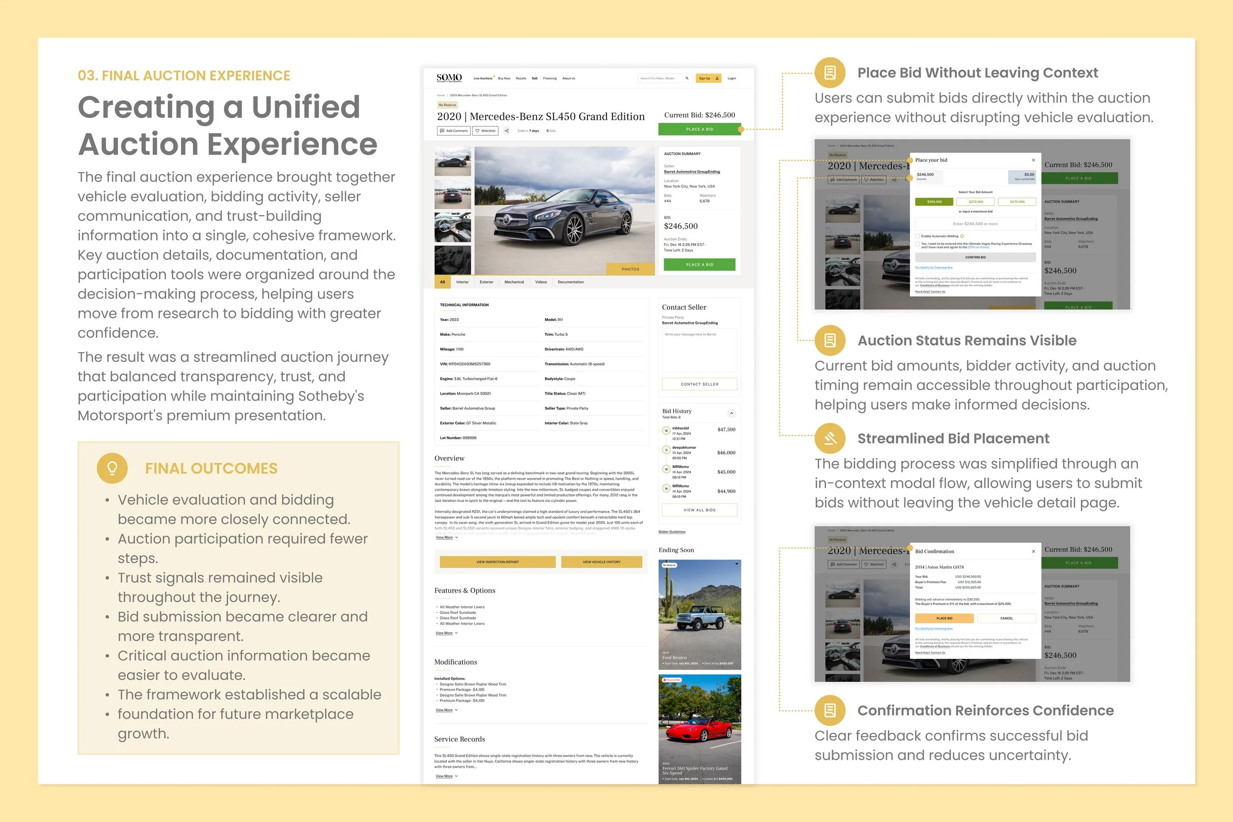
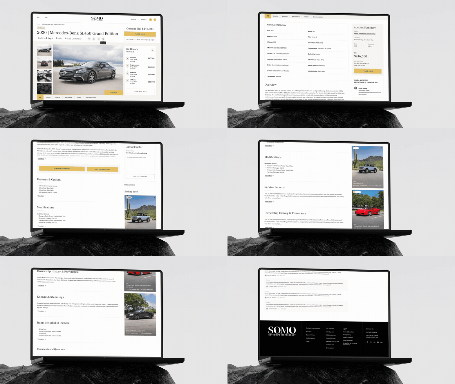
The auction experience serves as the platform's primary conversion point, making clarity, transparency, and real-time engagement essential to participation. The redesign focused on improving the visibility of bidding activity, auction status, vehicle information, and decision-making tools to create a more intuitive participation journey. By refining information hierarchy and emphasizing key auction interactions, the experience helps users evaluate opportunities more confidently while maintaining the premium presentation expected from a luxury automotive marketplace.
MOBILE AUCTION EXPERIENCE
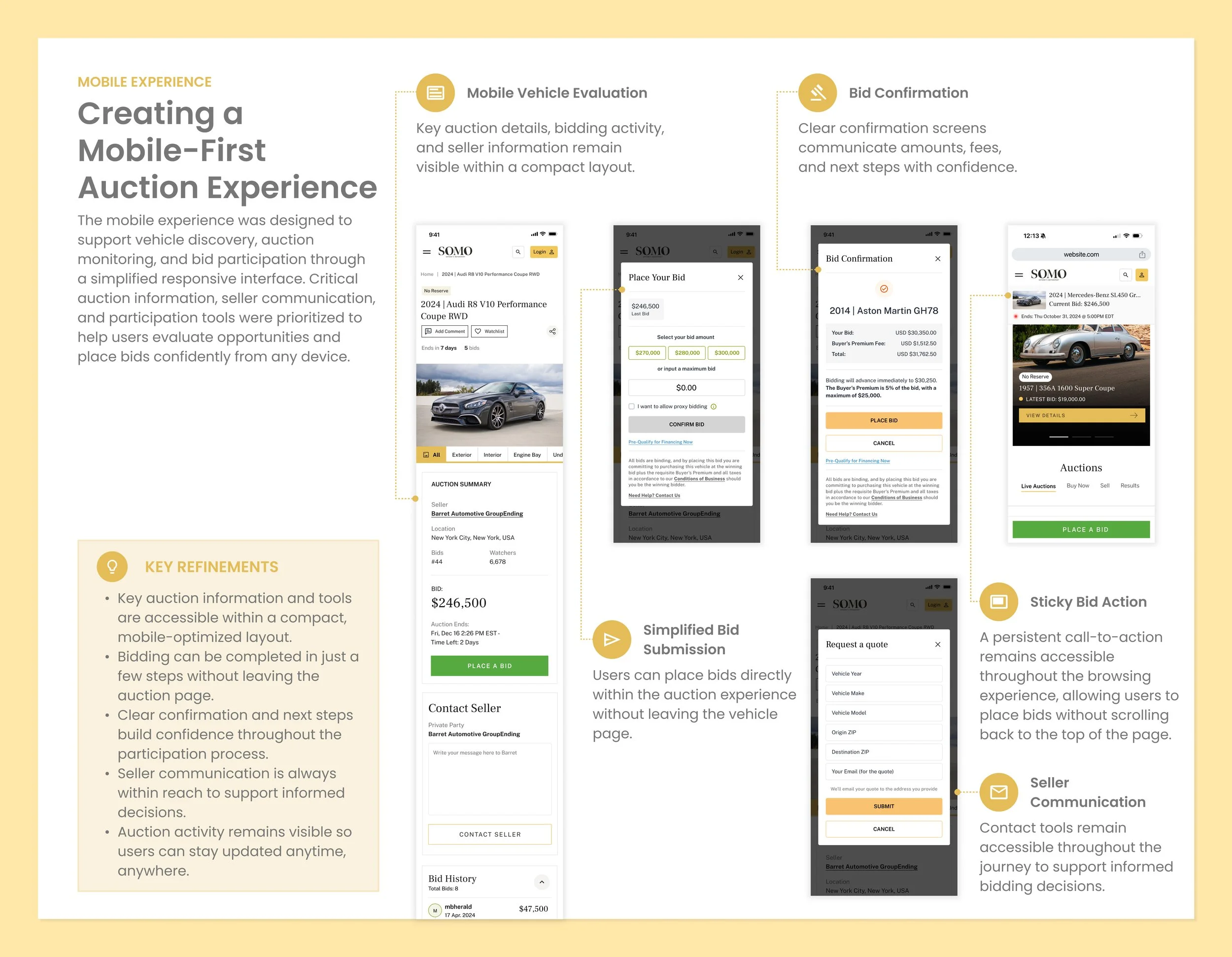
Creating a Mobile-First Auction Experience
The mobile experience was designed to support vehicle discovery, auction monitoring, and bid participation through a simplified, responsive interface. Critical auction information, vehicle details, and participation tools were prioritized to help users make informed decisions and engage with opportunities wherever they are.
AUCTION EXPERIENCE
Creating clarity and urgency throughout the bidding journey
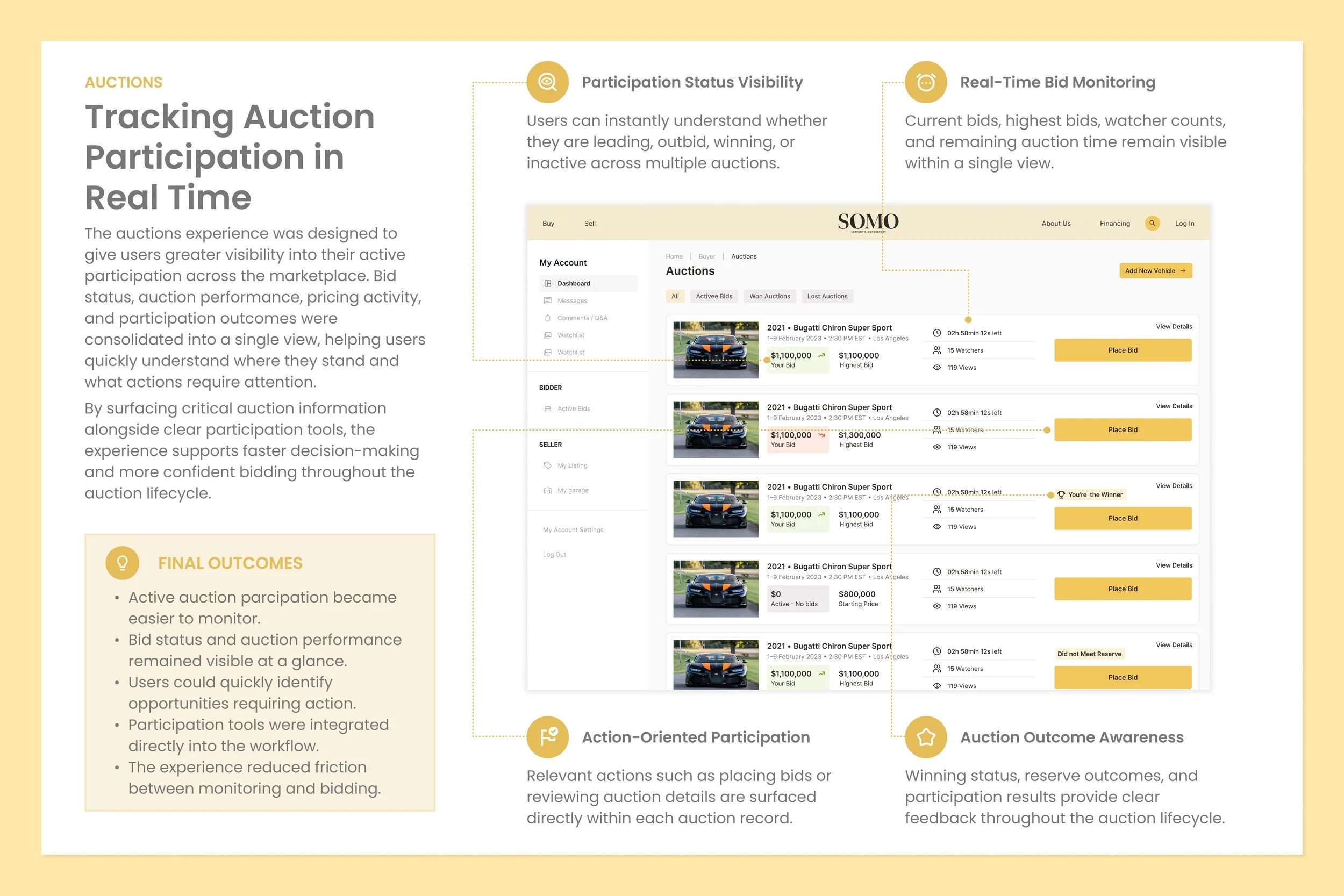
The auction experience serves as the platform's primary conversion point, making clarity, transparency, and real-time engagement essential to participation. The redesign focused on improving the visibility of bidding activity, auction status, vehicle information, and decision-making tools to create a more intuitive participation journey. By refining information hierarchy and emphasizing key auction interactions, the experience helps users evaluate opportunities more confidently while maintaining the premium presentation expected from a luxury automotive marketplace.

FINAL EXPERIENCE
Delivering a Unified Marketplace Experience
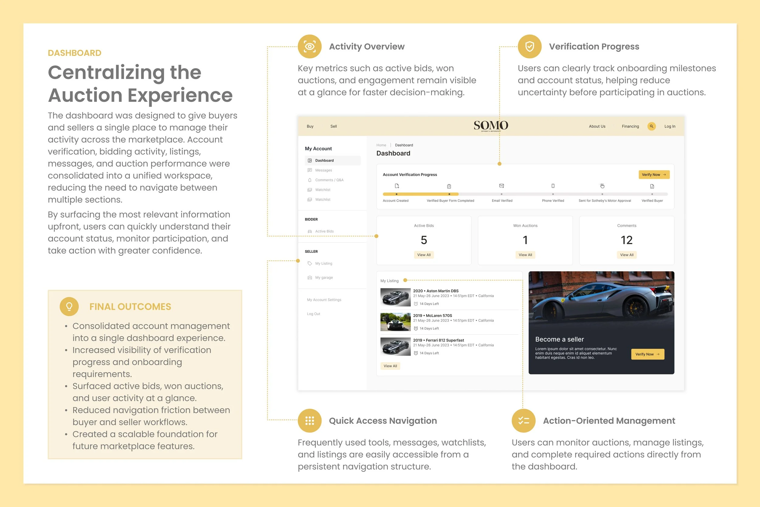
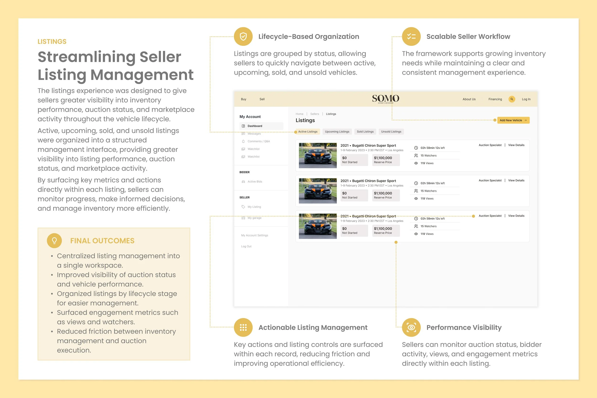
The final experience transformed a collection of marketplace interactions into a more unified ecosystem for buyers and sellers. Vehicle discovery, auction participation, inventory management, and account workflows were strategically connected to create a clearer and more seamless journey from exploration to action.
Enhanced visibility into marketplace activity, streamlined participation tools, and scalable management workflows helped reduce friction throughout the platform. The resulting experience balanced transparency, trust, and usability while supporting the long-term evolution of the Sotheby's Motorsport marketplace.
IMPACT
Creating a More Connected Marketplace Experience
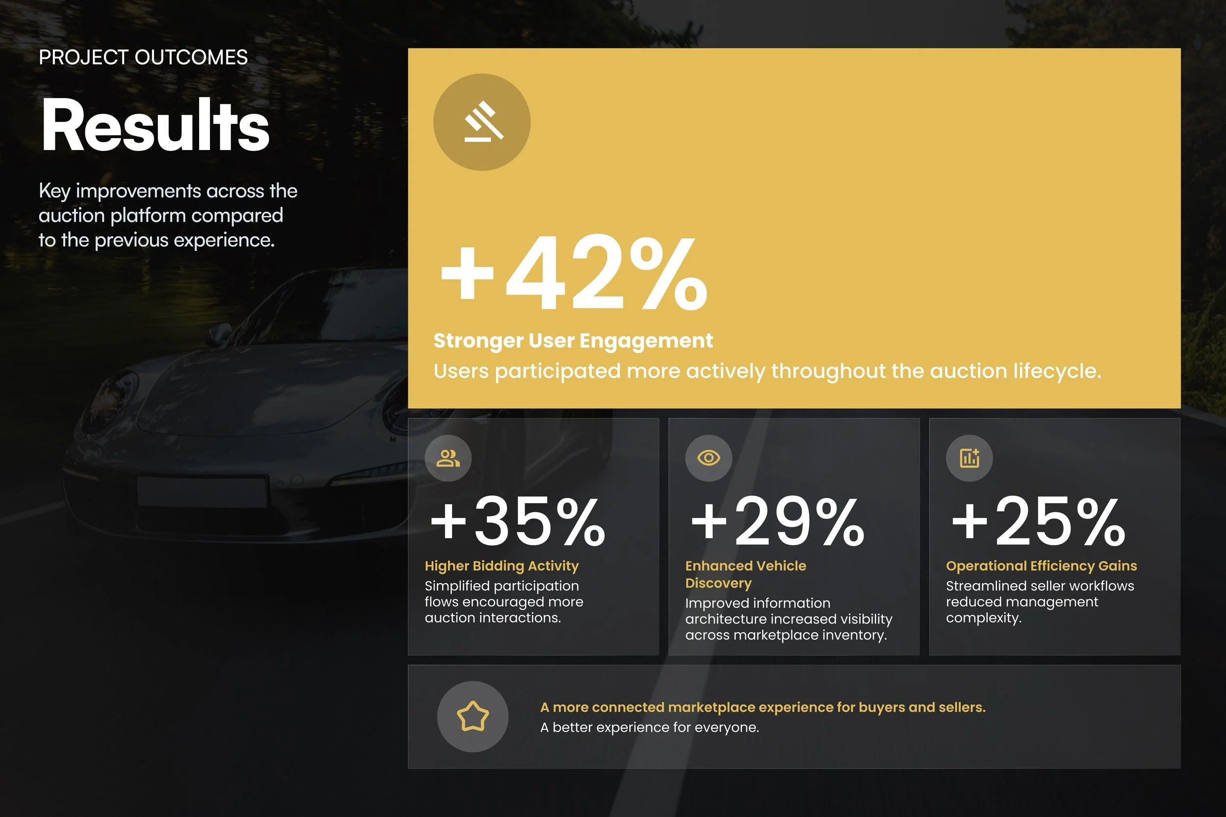
The project began with a simple challenge: marketplace participation extended far beyond placing a bid. Users needed to discover vehicles, evaluate opportunities, track activity, manage inventory, and make decisions with confidence across multiple touchpoints. The redesign focused on bringing these experiences together into a more connected ecosystem, creating clearer pathways between discovery, participation, and management. The result was a marketplace experience that felt more intuitive, transparent, and scalable for both buyers and sellers.
CONCLUSION
Building a Scalable Marketplace for Buyers and Sellers
The SOMO redesign transformed a collection of disconnected marketplace experiences into a more cohesive platform that supports vehicle discovery, auction participation, seller operations, and account management. By improving visibility into key actions, simplifying participation workflows, and creating clearer pathways throughout the platform, the experience became more intuitive and efficient for both buyers and sellers.
Beyond visual refinement, the project reinforced the importance of designing systems that scale. The resulting framework established a more flexible foundation for future marketplace growth while creating a more transparent, confidence-driven auction experience across every touchpoint.