Turning a fragmented website into a high-performing B2B lead generation channel
Restructuring content and refining user flows made it easier for users to understand Vivreau’s solutions and navigate the platform, supporting stronger engagement and lead generation.
Overview
Vivreau’s website made it difficult for users to quickly grasp its product offering or move between solutions. I contributed to the UX/UI redesign by organizing content more effectively, refining page structures, and improving overall flow to create a more intuitive and scalable experience aligned with business goals and measurable growth.
Key Focus Areas
• Clarify product offering across key pages
• Improve flow between solutions and product categories
• Organize content to support faster understanding
• Strengthen overall usability across the site
My Role
Product Designer
Visual Direction
Art Direction
Team
Valeria Diaz (PM)
Sebastian Roach (VD)
Aldo Mora (PD)
Victor Hugo (3DM)
Client
Vivreau
Website
https://vivreauwater.com
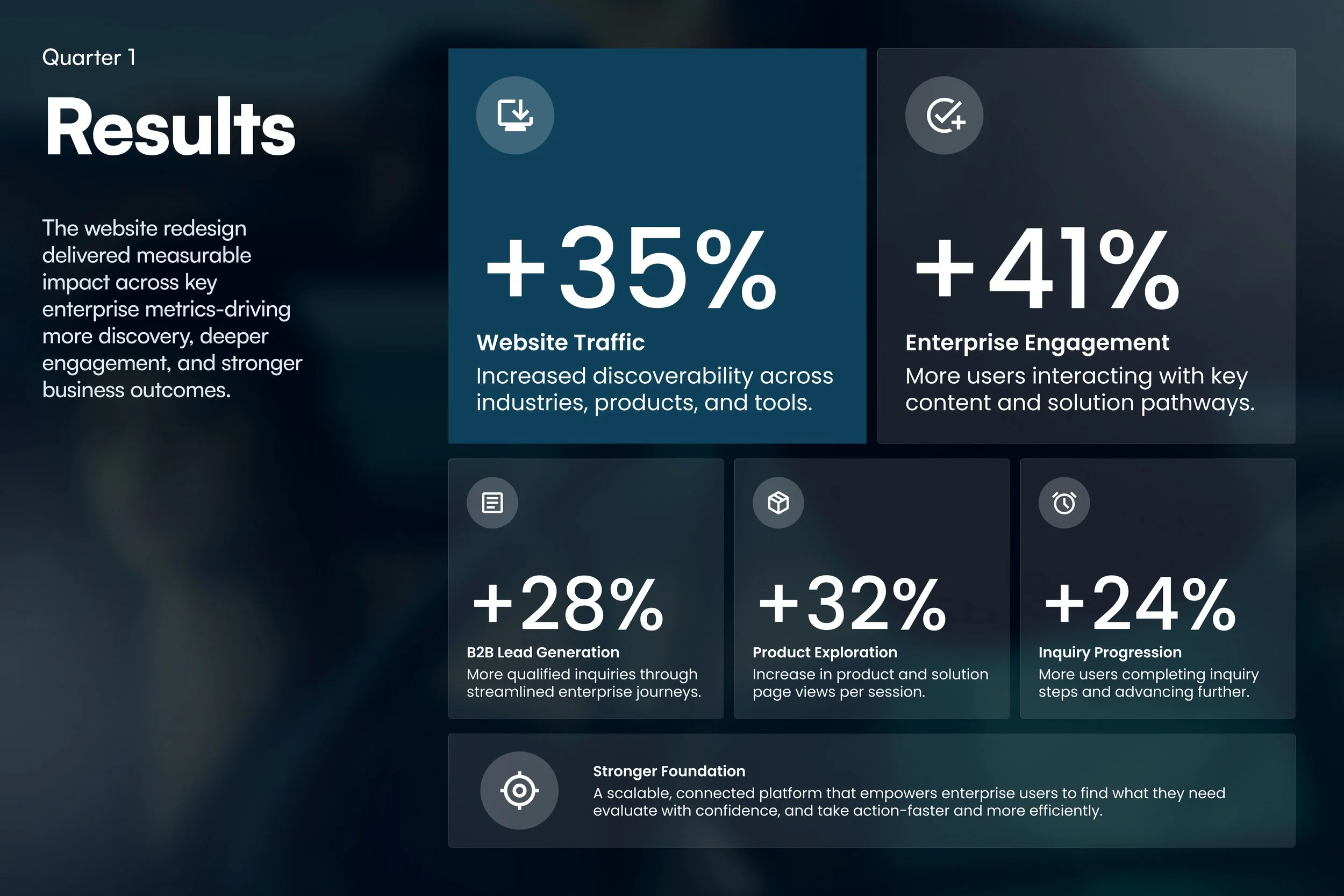
PROJECT IMPACT
Improving acquisition and conversion through better structure
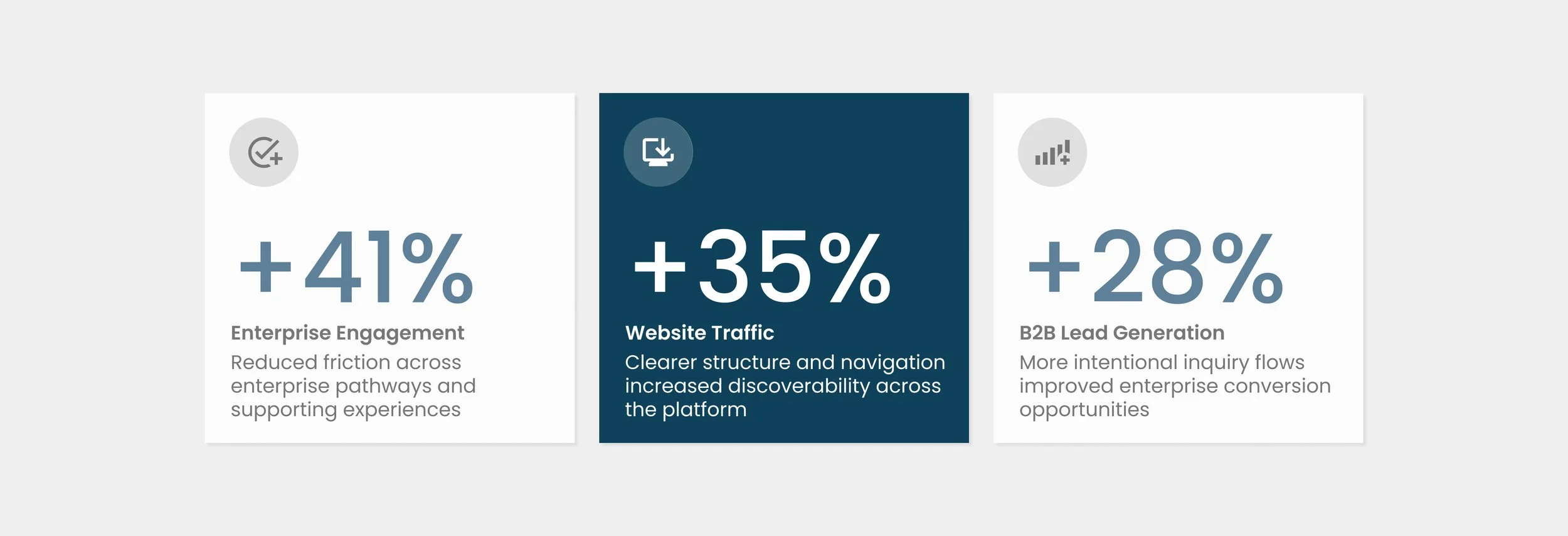
By restructuring content and refining navigation, the redesign clarified Vivreau’s product offering and improved how users move across the platform. These changes made it easier for users to understand solutions more quickly and efficiently across key touchpoints, increasing traffic and engagement while strengthening lead generation and conversion efficiency.
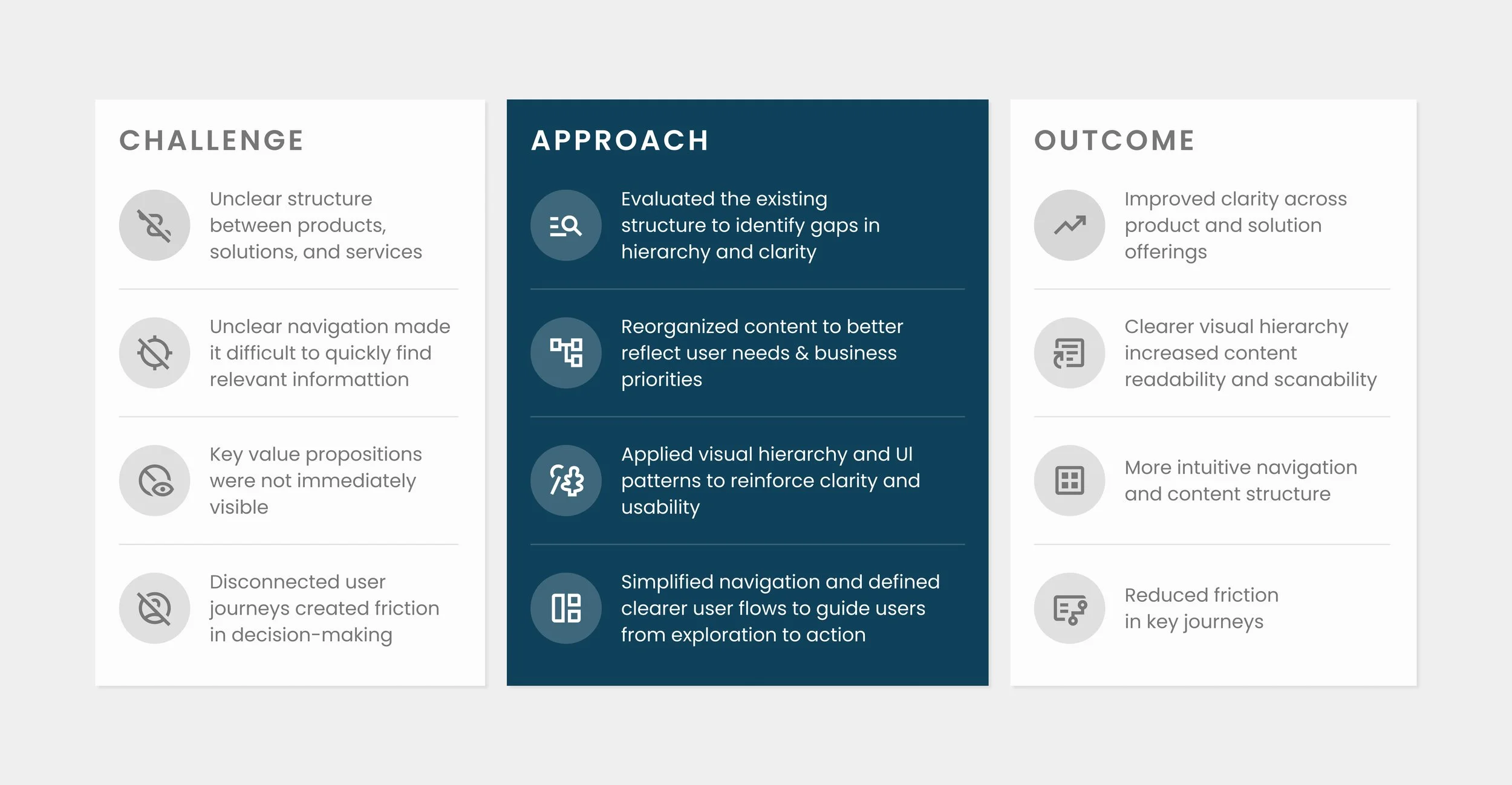
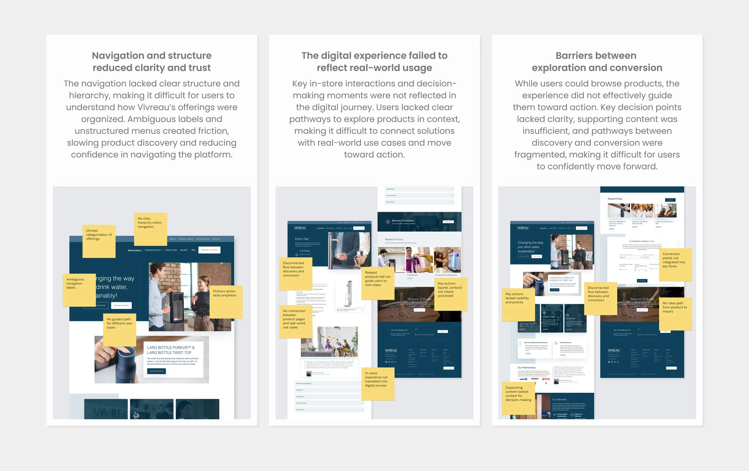
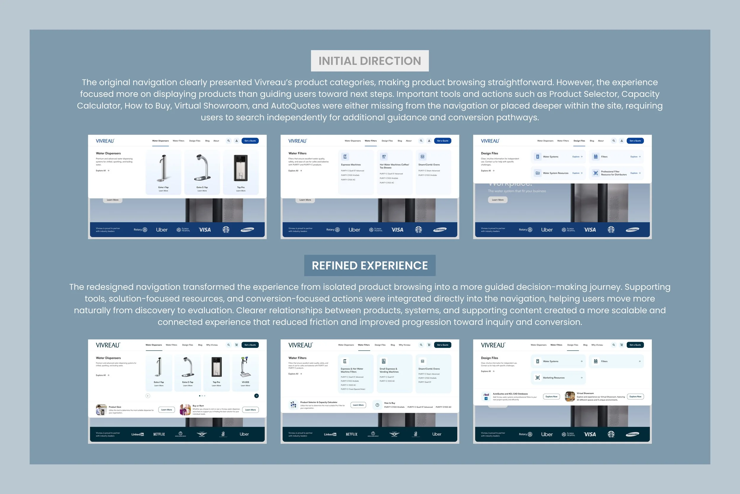
UNDERSTANDING THE PROBLEM
Simplifying a fragmented experience
A focused review of the existing platform revealed key friction points across product discovery, navigation, and content hierarchy. Rather than treating these as isolated issues, they were addressed as part of a broader structural challenge. The experience lacked clear pathways, making it difficult for users to quickly understand Vivreau’s offerings and move toward meaningful actions.
THE SOLUTION
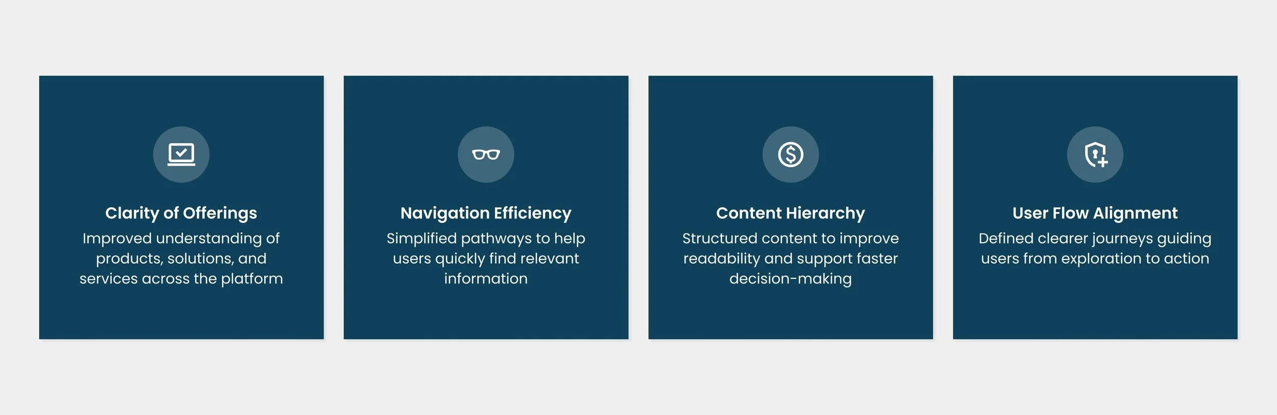
Defining success metrics
Success was defined by the platform's ability to improve clarity, simplify navigation, and support more effective decision-making. Rather than focusing solely on conversion, the goal was to help users quickly understand Vivreau's offerings, navigate confidently across products and solutions, and move seamlessly from exploration to action.
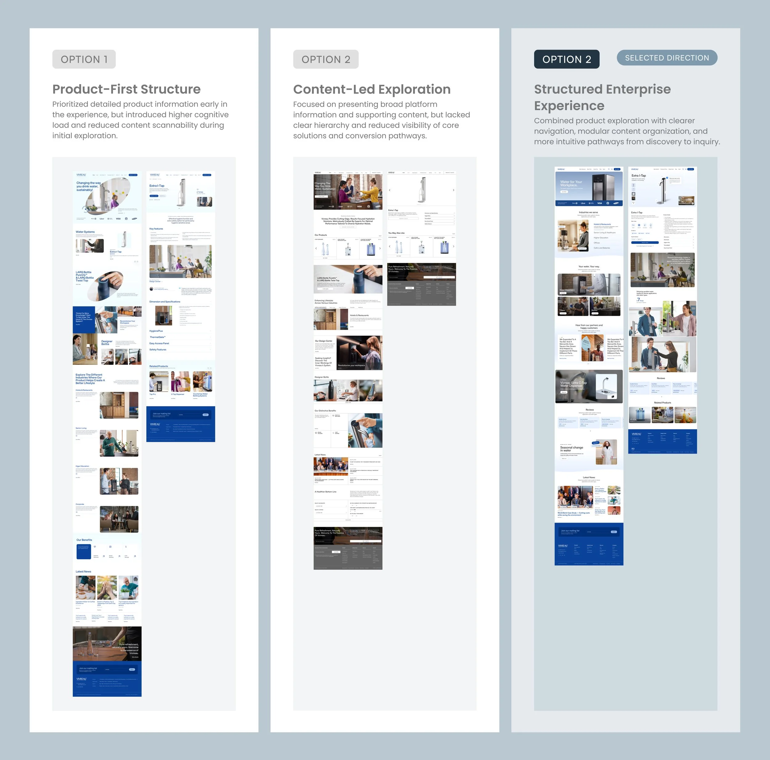
ANALYZING THE EXISTING PLATFORM
Identifying structural gaps
A focused review of the existing platform revealed structural and navigation challenges that limited clarity, discoverability, and overall usability. Key information was difficult to locate, relationships between products and solutions were unclear, and users lacked clear pathways to move from exploration to action.
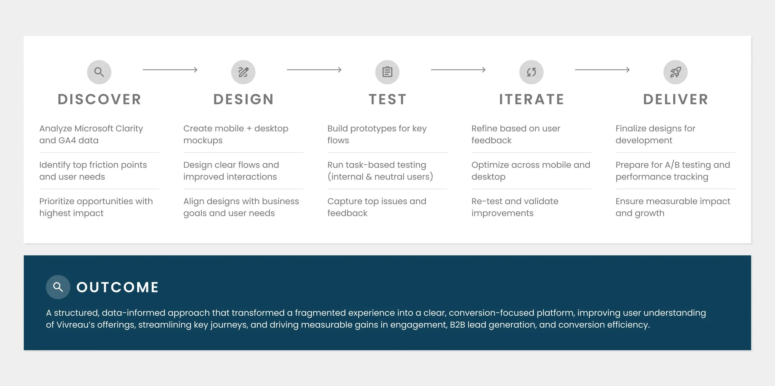
PLANNING & STRUCTURE
From insights to scalable outcomes
A structured, data-informed approach that transformed a fragmented experience into a clear, conversion-focused platform, improving user understanding of Vivreau’s offerings, streamlining key journeys, and driving measurable gains in engagement, B2B lead generation, and conversion efficiency.
PROBLEM STATEMENT
How can Vivreau simplify its complex digital experience to clearly communicate its offerings and drive qualified B2B leads?
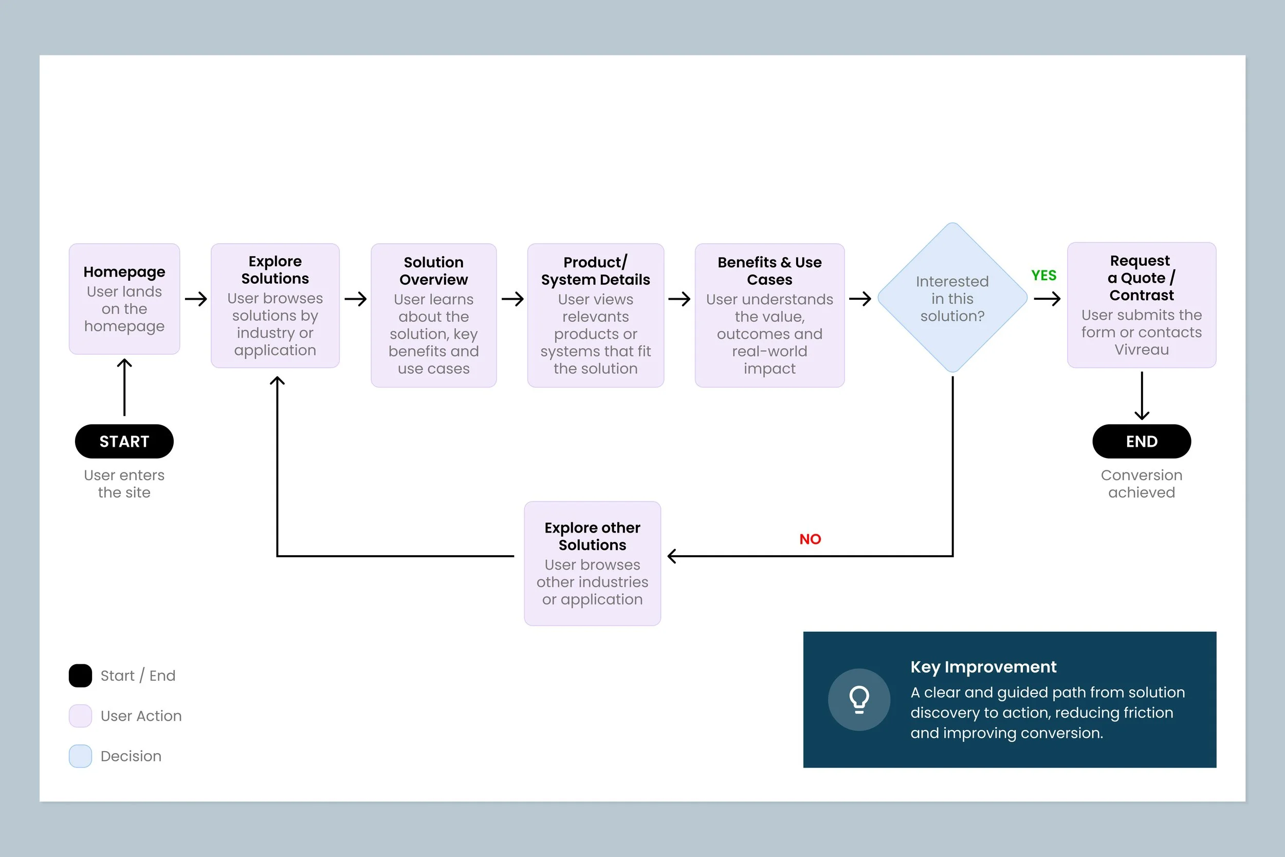
EXPERIENCE STRATEGY
Structuring Enterprise Journeys
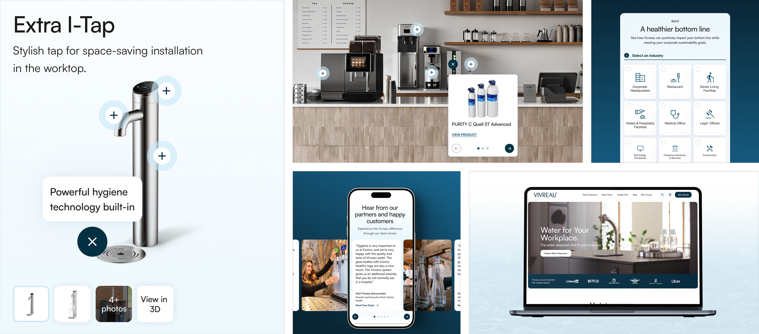
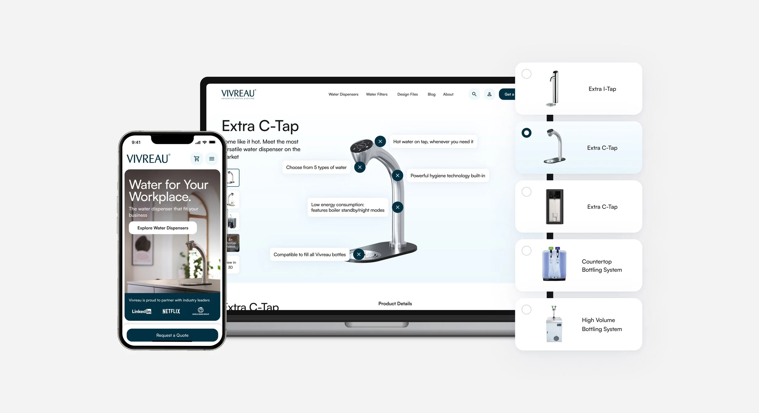
The redesign restructured the platform around clearer user journeys, helping visitors better understand Vivreau’s products, solutions, and services across every stage of the experience. By simplifying navigation, refining content hierarchy, and reducing friction across touchpoints, the platform created intuitive pathways from exploration and evaluation to inquiry, engagement, and conversion. This approach created clearer pathways from exploration and evaluation to inquiry, engagement, and conversion while supporting a more scalable and cohesive enterprise experience.
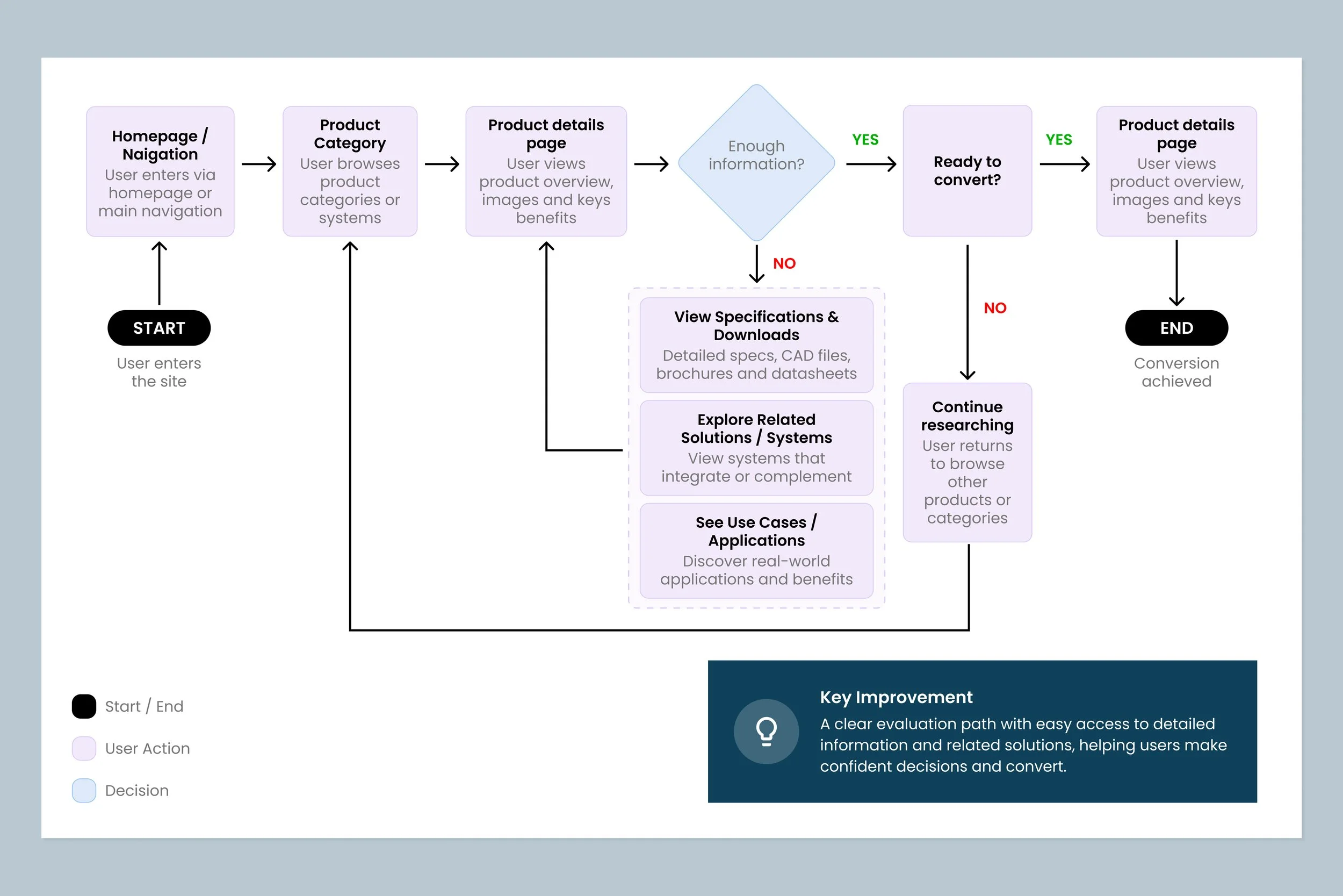
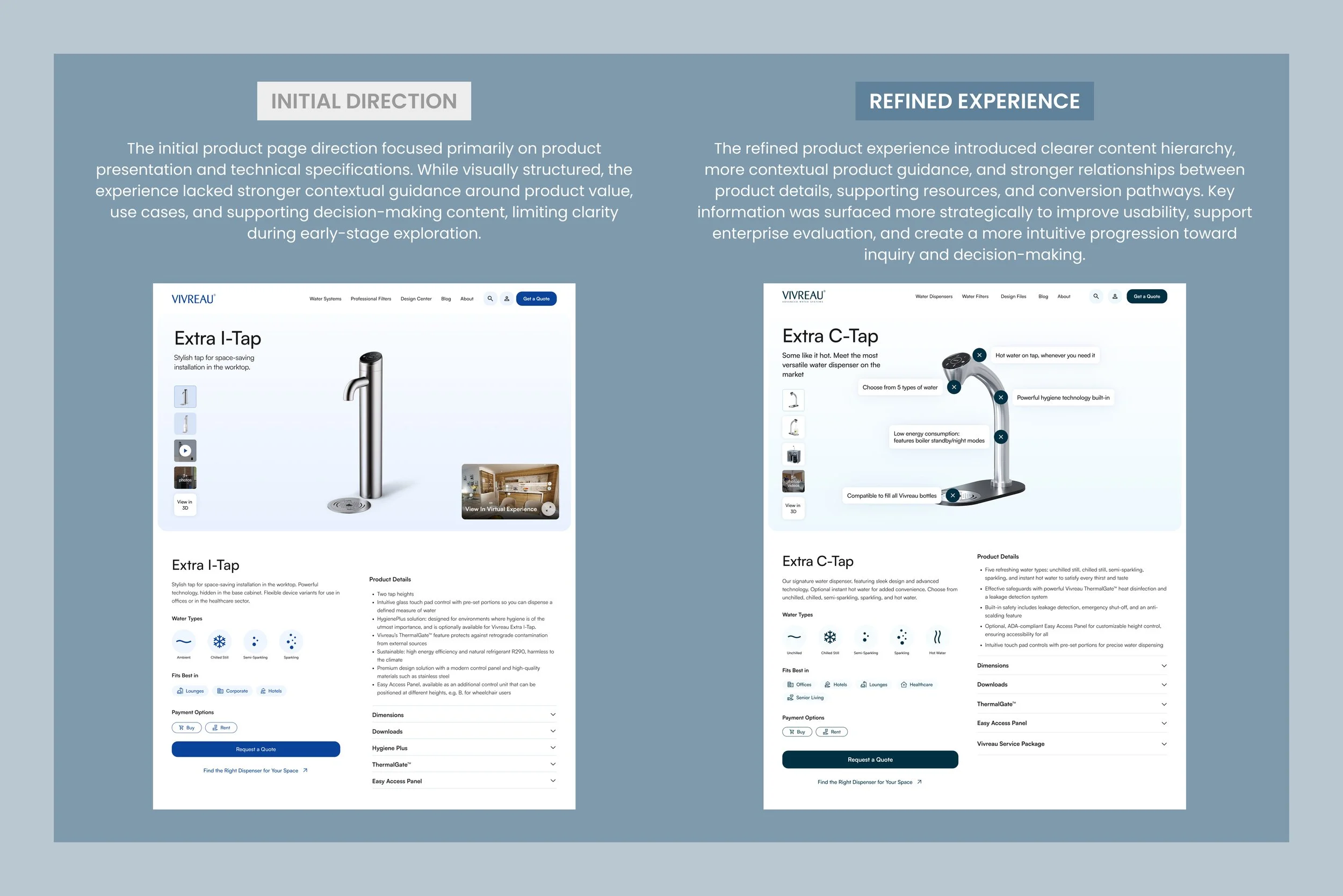
PRODUCT DECISION-MAKING
Balancing Product Depth and User Clarity
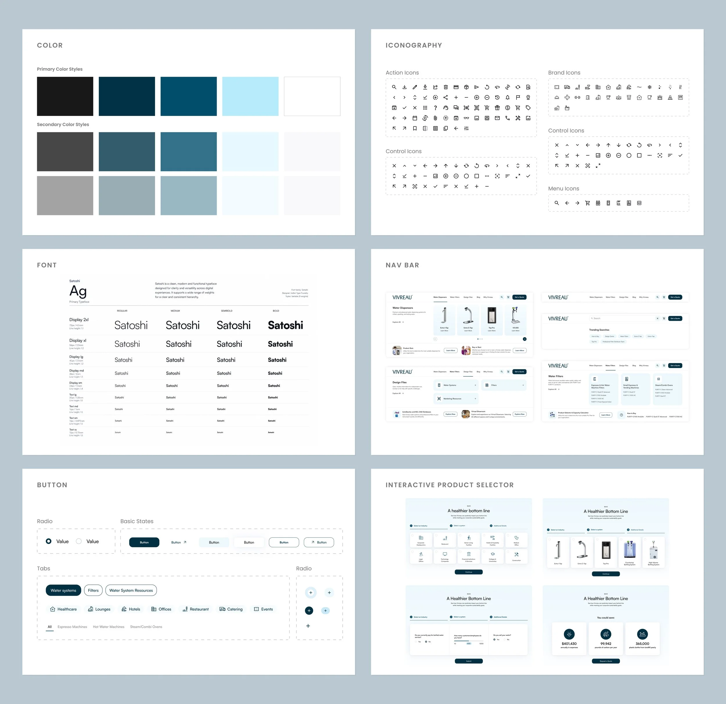
The redesign introduced a unified design system to create consistency across products, solutions, and supporting content throughout the platform. Standardized components, typography, spacing, and interaction patterns improved usability while reinforcing Vivreau's premium brand positioning. This system also established a scalable foundation that streamlined future expansion and ensured a more cohesive experience across desktop and mobile touchpoints. It now enables teams to deliver new pages and features faster while maintaining a consistent, high-quality user experience.
PLATFORM SCALABILITY
Building Flexible Systems for Long-Term Growth
The platform was restructured around scalable navigation patterns, modular content systems, and more connected user pathways. Rather than supporting isolated product browsing experiences, the redesigned framework created flexible structures capable of adapting across future products, industries, and enterprise needs.
DESIGN SYSTEMS
Creating Consistency Across Enterprise Experiences
The redesign introduced a unified design system to create consistency across products, solutions, and supporting content throughout the platform. Standardized components, typography, spacing, and interaction patterns improved usability while reinforcing Vivreau's premium brand positioning. This system also established a scalable foundation that streamlined future expansion and ensured a more cohesive experience across desktop and mobile touchpoints. It now enables teams to deliver new pages and features faster while maintaining a consistent, high-quality user experience.

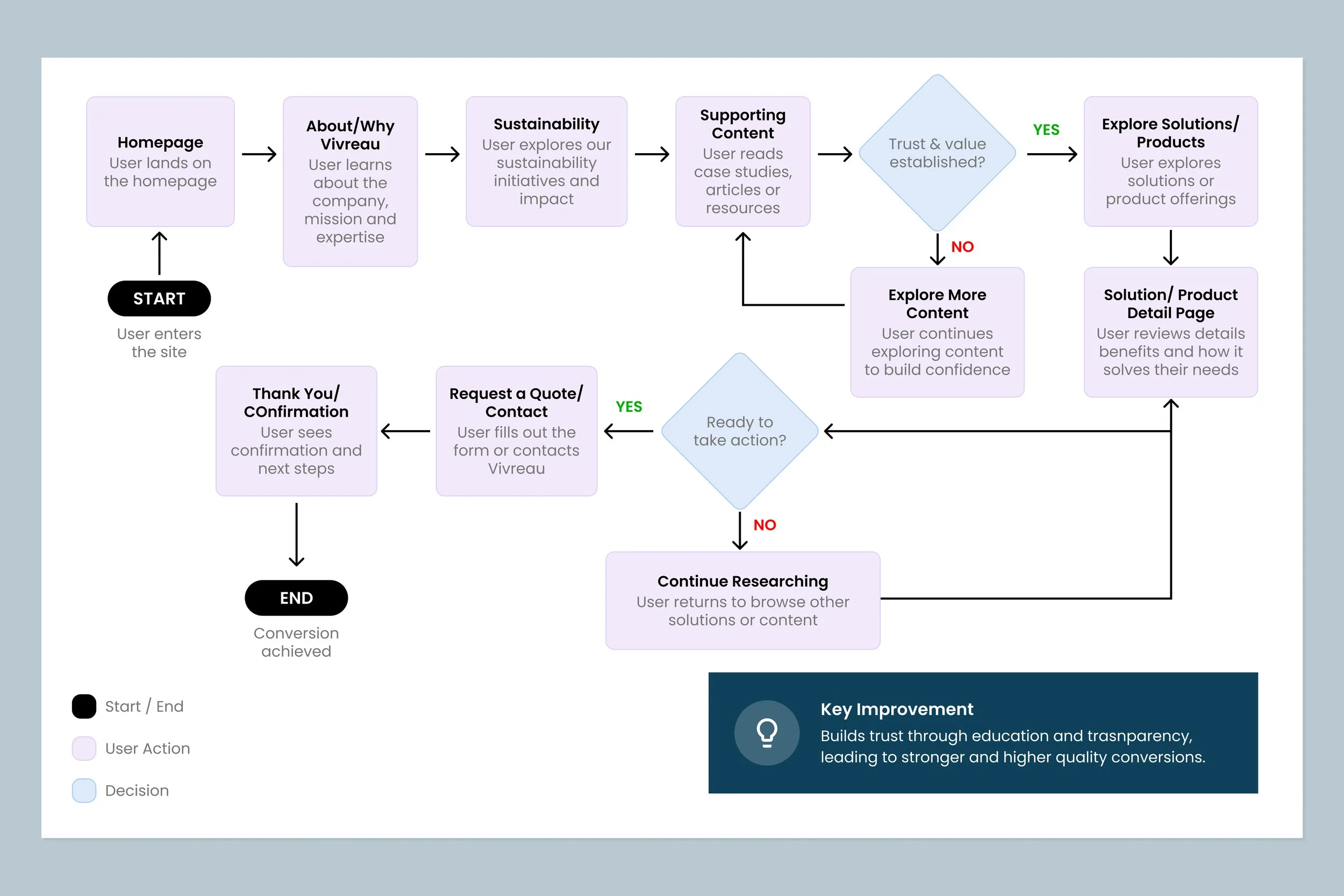
FINAL EXPERIENCE
Connected Enterprise Experience
The final platform experience transformed Vivreau’s fragmented digital ecosystem into a more connected and scalable enterprise journey. Rather than treating products, industries, supporting tools, and conversion pathways as isolated experiences, the redesign restructured the platform around clearer relationships, more intentional progression, and modular systems designed to support long-term growth.
By simplifying navigation, refining content hierarchy, and creating more contextual pathways between exploration, evaluation, and inquiry, the experience became more intuitive for enterprise users navigating complex decision-making journeys across multiple industries and solution types.
IMPACT
Transforming Enterprise Exploration Into Connected User Journeys
The redesign restructured Vivreau’s digital experience around clearer enterprise pathways, helping users navigate products, industries, supporting tools, and solution-based content through a more connected and scalable framework. By simplifying fragmented experiences and introducing more intentional progression across the platform, the redesign created a stronger foundation for product evaluation, enterprise engagement, and long-term platform growth.
The final experience not only improved usability and content discoverability, but also established a more flexible system capable of supporting future expansion across industries, products, and evolving enterprise needs.
CONCLUSION
Designing a more intuitive and scalable B2B experience
The redesign redefined how users navigate and engage with Vivreau’s products, solutions and supporting content by creating a more structured and intuitive digital ecosystem. The experience was rebuilt around clearer user journeys, improved product discovery and stronger connections between industry solutions, product systems and conversion pathways.
By simplifying navigation, refining content hierarchy and standardizing interaction patterns, the platform reduced friction across key touchpoints and made it easier for users to understand Vivreau’s offerings in context. The result was a more scalable and cohesive experience that supports product exploration, solution evaluation and B2B lead generation across both desktop and mobile touchpoints.